Latest Artwork
As I started to research the Cybermen costumes for a magazine feature, I became increasingly fascinated by their details. It was impossible to resist creating 3D models and it helps the research process as I pick out the details to include in the model. Working out how something has been put together is a very useful process, and studying something closely enough to copy it makes you notice all kinds of minute details.
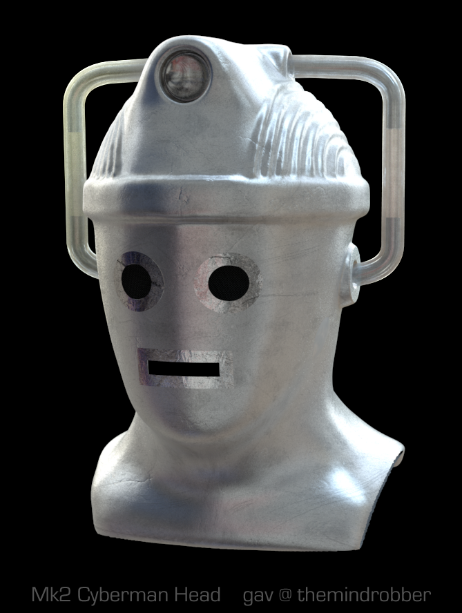 I've made several attempts at modelling a sixties Cyberman head, but all met with failure. The closest I came was when I had to rush together an Invasion model for a job, but I drafted in my mate Daz to help me. He did a lot of work on it and I never felt it was a model I could call my own. I've made several attempts at modelling a sixties Cyberman head, but all met with failure. The closest I came was when I had to rush together an Invasion model for a job, but I drafted in my mate Daz to help me. He did a lot of work on it and I never felt it was a model I could call my own.
This time, instead of using Cinema to create the main shape, I decided to try sculpting it in ZBrush. This was a much more rewarding experience and I'm pretty happy with the final outcome. The headband should be a little sharper and the collar isn't perfect but it's close enough. I imported the sculpt into Cinema and finished off the eyes, handlebars, and lamp. This is the design which appeared in The Moonbase.
Many people assume that the Cybermen costumes used in Tomb of the Cybermen were exactly those as they appeared in the Moonbase, but it is not the case. I must confess, I wasn't aware of the differences until I did these models and I was quite surprised by how much they changed. Here's the complete Moonbase costume:
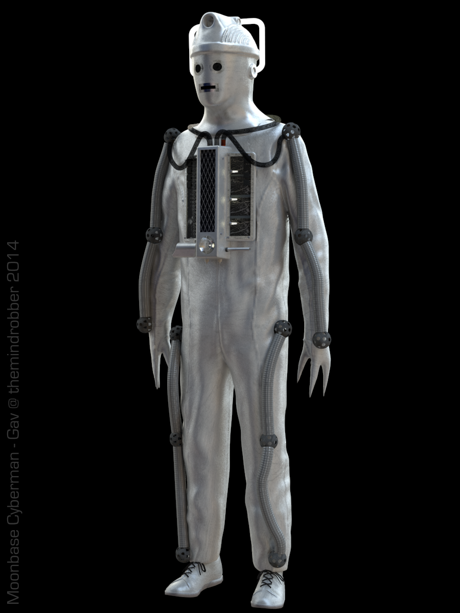 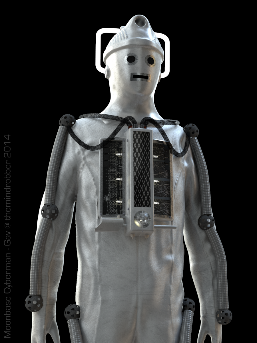
As always, I want to try to create artwork which is true to the original concept, yet fresh and exciting. Here's my take on the Moonbase Cybermen - coming out of the darkness with electricity firing from their fingertips. I love this weapon and it was nice that it was retained in the new series. It does seem like overkill, though, that they also have a gun built into the lower part of their chest unit, and also carry hand-guns in The Moonbase too!
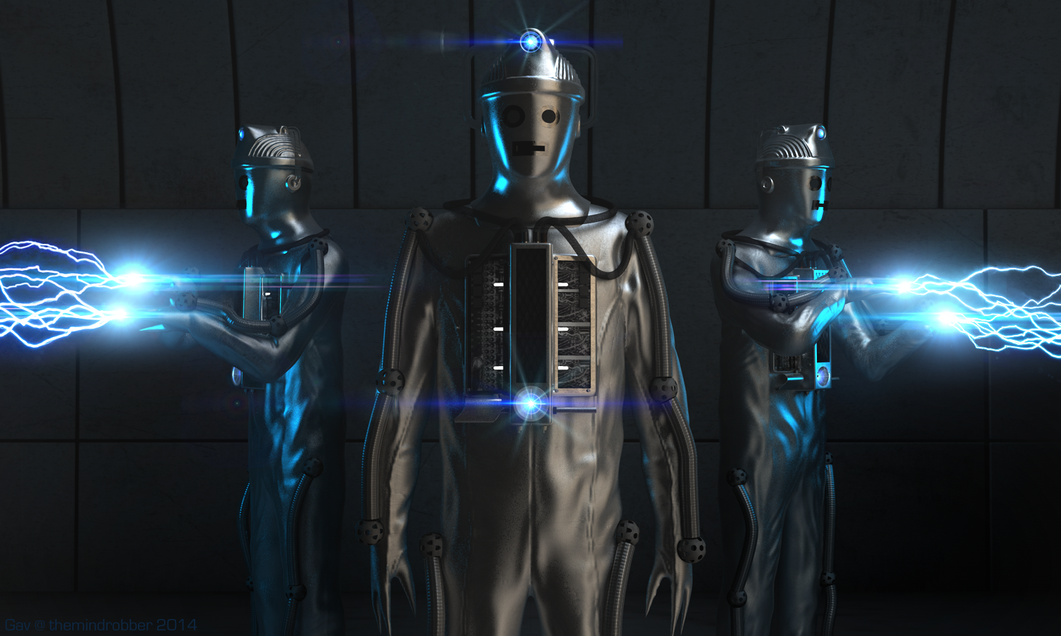
As these costumes were brand new, the pipes over the shoulders were neat and symmetrical. They were made of Crinoline though and were prone to damage. When the monsters returned for Tomb of the Cybermen, a number of differences had been made - not all of which were intentional.
The mainly unintentional change was that the pipes over the shoulder had become creased and untidy. Some had lost their third pipe entirely, leaving just two. Due to the poor quality of the source material it's actually quite hard to make out what's going on with all of them, and each costume is arranged differently.
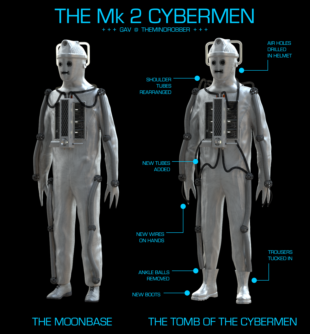
It was felt that the area below the chest had looked very bare in their debut, so extra pipes were added for Tomb which connected from the legs to the chest. New little black tubes were also added to the hands. The laced-up boots from Moonbase were changed to wellingtons and instead of running the trousers over the outside, they were tucked in. The problem with this was that the balls at the ankles got in the way so these had to be removed. Mostly the pipes were tucked in too but these did pop out on some costumes. To give the actors more air, holes were drilled under the headband and on the face.
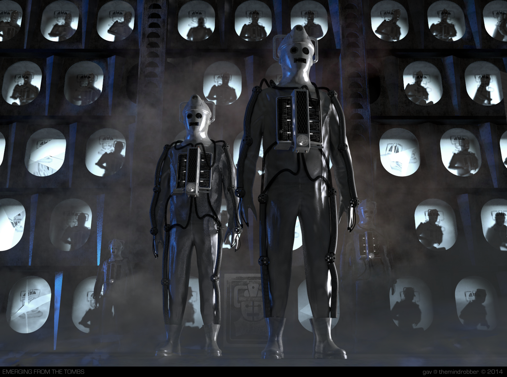
Again I wanted to create an image that was evocative whilst true to the story. Most of my ideas for artwork come from asking, "How would this episode look if they just had more time and money?" I don't like to actually redesign things but if you look at Tomb of the Cybermen you can see they took their budget right to the very limit. If they had a bigger studio and twice the budget I'm sure the honeycomb would have been bigger. So that's all I decided to change - and then the rest is lighting and atmospherics. I wanted it to be sinister. What's interesting here is that I had nothing behind the camera for the silver on the face to reflect off. It's made the eyes and mouth big, empty holes. I could have fixed that and given them some shine but actually, I think it looks more horrific and unusual this way. And it's actually pretty accurate as you can see here.
 So that brings us to the Wheel in Space. When I was doing my researches I was not initially enthused by this costume but, having learnt all about its design process, I now find them far more interesting. So that brings us to the Wheel in Space. When I was doing my researches I was not initially enthused by this costume but, having learnt all about its design process, I now find them far more interesting.
I won't go into the detail here because hopefully the full story will be coming to a magazine near you very soon but sufficed to say there's a very interesting tale to be told.
The costume designer and director on The Wheel in Space together decided to do away with the flexible pipes and make the monster more like Kit Peddler's original scripted description, in which he described a system like pneumatic rods or joints which reinforced the arms.
Is is noteworthy too that this costume also has its chest unit positioned upside down so that the lamp became a weapon in the chest. This was an interesting combination of The Tenth Planet design where the lamp was a gun, and The Moonbase, where the gun could be removed from the slot behind the lamp.
There will be an update to this page as there's more imagery to be revealed. Hopefully soon!
Follow me on Twitter and Like my Facebook page to get the updates! |