Redesigning the TARDIS is a mamoth task and great responsibility. The designers, under the guidances of new boss Steven Moffat have created something new, interesting and attractive for the 2010 series with Matt Smith, whilst creating a retro look harking back to Peter Cushing. How would I have done it?
When news started to leak out about the new TARDIS console room, I started to wonder what sort of design I would prefer, if I had the opportunity to create the iconic set for the Doctor's Time Machine. Being a traditionalist, my design ended up being probably a little predictable and trying to incorporate as many of my favourite features from the past as possible.
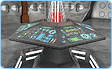
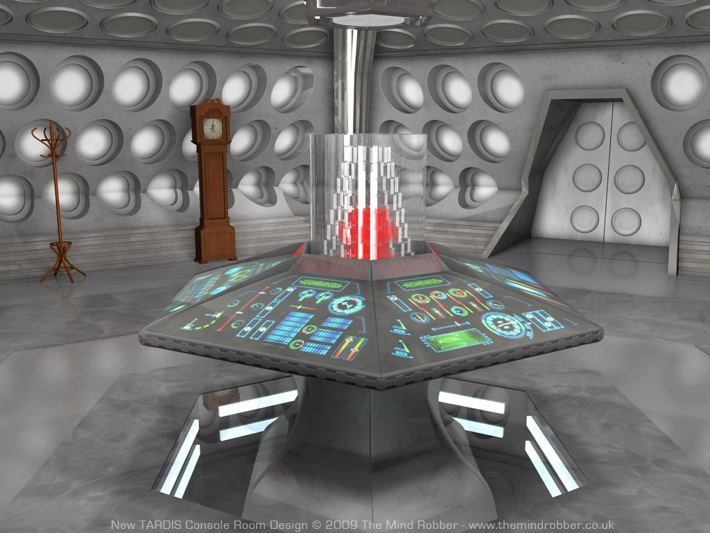
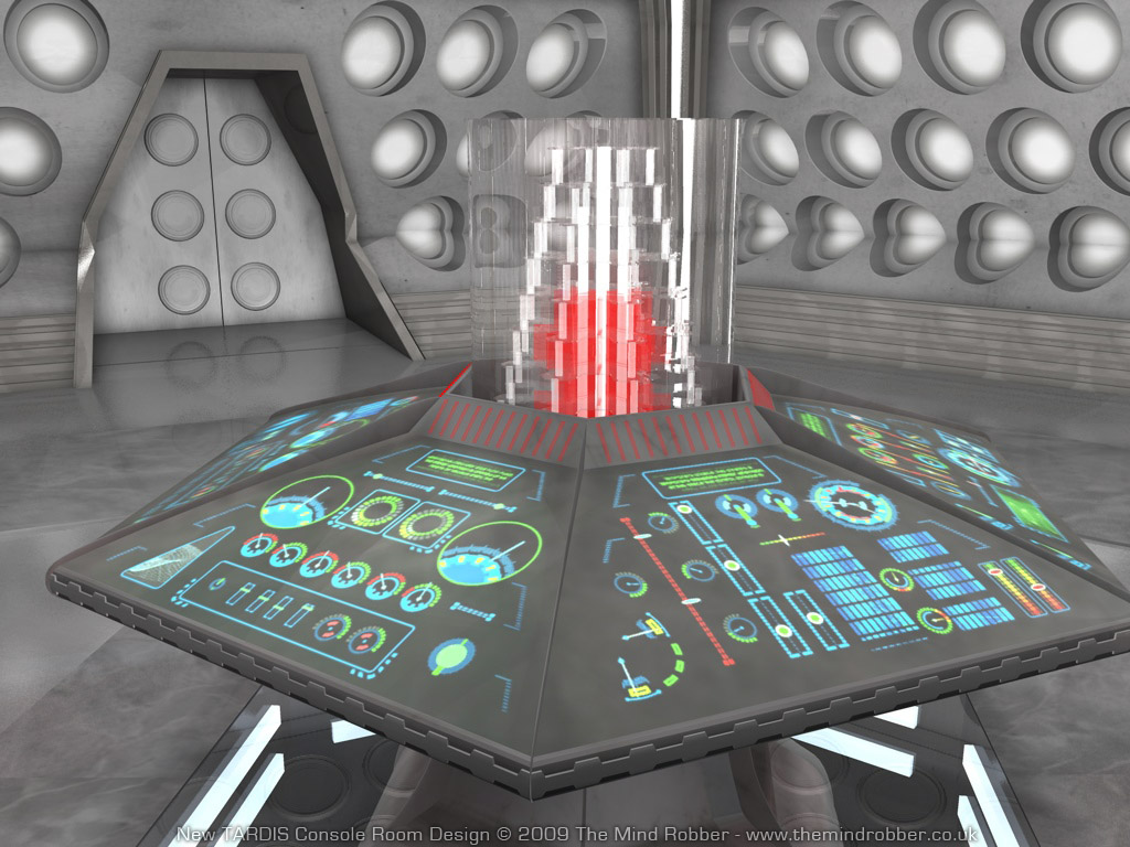
I always felt that a TARDIS console room from the William Hartnell era should be the starting point. Large, clean, white, bright, and with the occasional antique. I'm not a fan of the flying buttresses introduced into later models; I think they break up the sense of space, but I like the idea of having something other than simply vertical walls, so I went for a stepped diagonal wall stucture.
I like the sense of depth and texture brought by the 1960s roundels, so I decided to use them for the main wall, although it caused me a headache with the row of them set at the point at which the walls angle. A further nod to the Peter Brachacki room comes in the form of the 'lampshade' device over the console. I really dislike the modern convention of tying the console to the ceiling.
In the walls, there are nods to the 1980s design (seen from Meglos onwards): The ribbed skirting panel and the vertical columns I think help break up the circles. And then for the ceiling I opted for a second phase of flat roundels.
With the exception of McGann and season 14, I've always enjoyed the fact that the console room was attempting to be futuristic. And hence, it was always 'of its time' - showing what we thought the future would be like by extrapolating today's technology. Whilst the new series is commendable in its effort to look timeless, I dislike the fact that it's no longer a future we - it's alien and unappealing. The new series has the first TARDIS I wouldn't want to call home, which is a shame. I wanted to create something which reflected current trends - and what better than a touch-screen console? iPhones popularised it in 2009 so I thought that suface technology would be a nice direction to take the TARDIS. You might notice that the actual configuration of the controls is exactly that of the 1960s console with some additions.
I also found myself favouring the 1980s central column above any other and I also like the detailing around the top and round the egde of the console, so this has been carried into my version. I have to credit my friend Stu with the suggestion to show the console running down beneath floor level and he also pushed me into the wise decision to think the base out, because I originally had it true to the Hartnell 1960s dimensions, and you wouldn't believe how inelegant it looked.
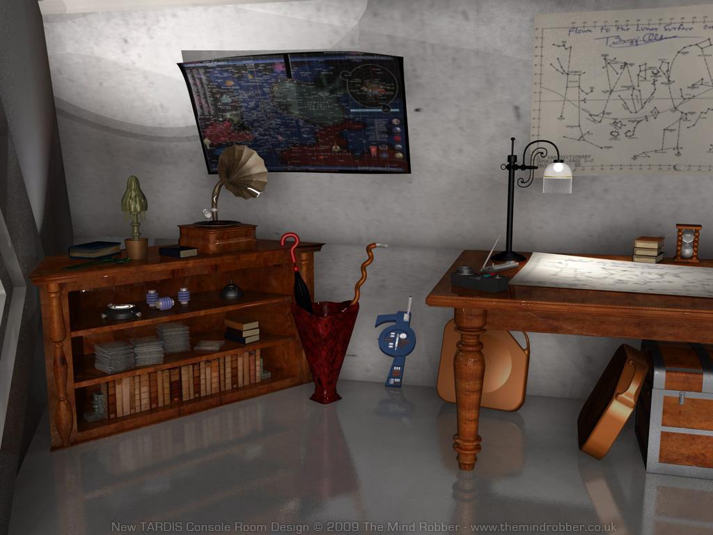
Finally, the Doctor's workshop. Hidden beind a set of panels which retract into the floor and ceiling, one sixth of the console room is an alcove which has a workbench (actually a an antique Victorian table) and a variety of memorabelia from the Doctor's past adventures, along with notes, drawings, thoughts, and a few things he probably shouldn't have picked up. How many items from past adventures can you spot?